5 - New UI Design
hello
So clearly I'm bad at writing blogs for my game. The coronavirus & recent protests against racial violence committed by police & general alienation from moving to a new city but also unable to leave our new apartment has made work very slow for me. I'll try to make more shorter blogs showing off new features I made for my game.
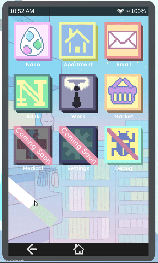
Today I'll talk about the new UI I've been implementing for the NanoCom (the computer you use for literally everything in the game)
The UI is obviously very influence by the Nook Phone in ACNH haha. (The added music is just placeholder fyi)
why i made new UI
For a long time, I struggled with drawing out icons for my games. I switched between either using pixel art, or just drawing icons on my ipad which always felt bad. Not only am I not a good artist, but trying to draw icons always felt non-uniform and never inline with a specific style. For reference, this is what the NanoCom home page used to look like

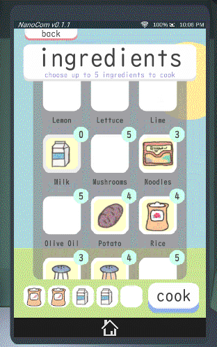
The pixel art icons aren't terrible, but then the pantry app (selecting ingredients to cook) looked like this

I was never happy with these designs, but I also didn't know a good solution for my art skill gap. Once I bought a $15 UI kit from the asset store which I never really liked and have now pretty much thrown away. I even replaced all the drawn food ingredient icons with low-poly 3D objects using rendertexture, which actually ended up working well since I could use those same objects for ingredients in the frying pan, but I couldn't do that for every other text.
And then I played ACNH and fell in love with the UI design (the UX design though.... not so great lol). I liked the brightness and roundness of everything, and it showed me that having very simple, flat icons can be very elegant. I kinda realized in the back of my head that I would need to use a vector art program to make these kinds of rounded icons, so I FINALLY bit the bullet and set out to learn Illustrator.
All of my previous times using Illustrator were a nightmare. As someone who knows Photoshop pretty well, Illustrator's workflow and keyboard shortcuts felt completely backwards. Nothing really made sense, so even after years of interest in vector art, I just never got past the weirdness despite always having it through my CC license. But since I was so determined after seeing the Nook Phone, I paid about 12 bucks for a Udemy tutorial class to learn Adobe Illustrator. After 4-5 hours of online video tutorials, everything completely clicked and I was able to make all the icons you see in that first video. Working with shapes made it super easy for me to make a consistent UI/icon kit. Learning Illustrator has given me so much freedom in UI design, and I'm really sad I never put in the effort to learn this program before.
The new NanoCom still needs a lot of work, but just from adding cleaner UI/Icons and adding in simple tweens and button sound effects has given the NanoCom a 10x better feel. It's also a good feeling redesigning something because I know I'm honing in on a consistent style that'll serve a building-block for other designs in the rest of the game. The next thing I'm working on is redesigning the entire Apartment to be more modular/customizable and less hard-coded for only one layout design, and having one piece of my game with a consistent design will help guide the direction I take with the new Apartment(s) system.
I'll leave it here for now. the lesson here is that working hard towards an aesthetic you personally enjoy, even if it's not totally driving the core game loop, can make you feel so much better about your project. I guess another lesson is to pay for online courses whenever you have a known skill gap, especially if it's less than 20 dollars.
Thanks for reading i love you!
NanoPets
A virtual pet game for PC and Mobile
| Status | In development |
| Author | Jamsf |
| Genre | Simulation |
| Tags | Cute, Life Simulation, Management, passive, Unity, Virtual Pet |
More posts
- Update - sorry been busyMar 07, 2020
- 4 - Artificial Intelligence Progress in NanoPetsAug 05, 2019
- 3 - Japan Trip PostmortemJun 11, 2019
- 2 - On Virtual Pets (part 1 of 2)Apr 15, 2019
- 1 - First Post!Mar 13, 2019

Leave a comment
Log in with itch.io to leave a comment.